 Before I even start, I want to make something abundantly clear about this piece. I am not in anyway accusing anyone of being the least bit racist at all. To me, that is one SERIOUS word. I consider it an epithet, and if applied it had BETTER be defensible, cited by evidence, and used with total caution. This is about tunnel vision only. Thank you, and read on.
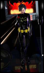
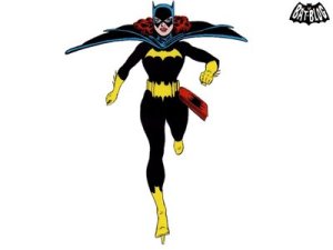
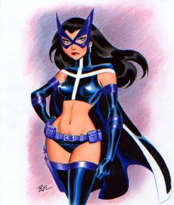
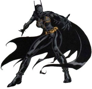
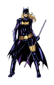
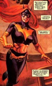
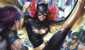
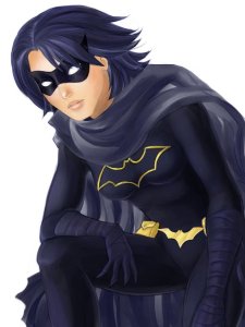
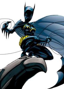 Sometimes, the myopia of comic companies, their overlord entities, and their creative partners are more compelling mysteries than Batman could ever dream of. This is about one of those situations, and the deeper mystique/conundrum concerning the trappings of the situation itself. As you probably already know, especially if the title there made you intrigued, there was this character named Cassandra Cain, and for a while she was Batgirl. She showed up during the epic “No Man’s Land” storyline in the Bat-books where Gotham City is sealed off and abandoned by the whole country as an unsalvageable hell-hole after a massive earthquake. Cassandra arrives, and ends up becoming a Batman approved operative. In a short time she gets her own title. I’m more than a casual Batgirl enthusiast historically. I picked it up at issue one, and stuck with it until the initial creative team split after two years. She was an interesting girl to say the least. Raised by her dad, David Cain, a ruthless world-class assassin in solitude, never spoken to, or heard from, to be the most focused member of her dad’s trade ever. Her mother that she didn’t know was the infamous Lady Shiva, considered to be the world’s deadliest woman and maybe human. She was slowly learning language and the combined Batman and Babs Gordon were trying to overcome her deep-rooted killer indoctrination. She could predict her opponent’s next move and never lost a fight. She had killed before, and was ashamed and trying to make up for it, sometimes to a death-wish degree. She was obviously Asian, a rarity in the DCU and unheard of in the Bat-camp. To be honest, I loved her as a character, just not as Batgirl. Her full-faced mask was a trendy turn-off to me. She was also too dark and complex for that particular identity. She palled around with Stephanie Brown, The Spoiler, and she was my pick for the successor to Babs from her first appearance in the title. She had the spunk and endearing charm I wanted in the role. After she quit the job, due to Batman’s apparent demise in Final Crisis, she gave the name over to Stephanie, and I was more than ok with that. However, I didn’t want the baby thrown out with the bathwater. Cassandra actually becomes a heavy for a bit, a move that enraged throngs of fans, and winds up with a whole new identity as part of the resurrected Bruce Wayne’s Batman, Incorporated. Her new moniker is the Black Bat, based out of Hong Kong, with her old costume no longer brought down with the face covering cowl but a ’60’s TV Catwoman-style mask instead. I rejoiced at the wisdom of this decision. Brilliant, all the way. Next (wait for it…) came the New 52, and *poof!* she’s gone.
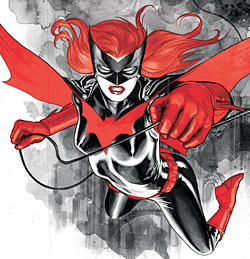
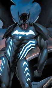 There was another character introduced to the Bat-camp in the wake of this new venue. His name is Batwing. His secret ID was David Zavimbe, an African national, who is a member of the ‘Inc.’ crew. As stated, he lives in the Dark Continent, and he gets a series that debuts with the first wave of the New 52, as well as a position on the doomed JLI title. David lasts 19 issues before he’s out of the title. JLI lasts until the release of it’s first annual, well under the other book and Batwing hangs up the name 7 months later. He is replaced by Luke Fox, son of Lucius Fox, Bruce’s business associate for over 25 years. With heavier ties to the Bat-world proper, it’s obvious that the batty fans need an anchored character. His title continues with rocky sales to this day. He’s stationed in the Congo, once more fighting the good fight. Here’s my question: why is this character getting the special treatment and Cassandra is off the map? I appreciate the effort and all, but isn’t the Black Bat a hell of a lot more logical as a title-holder? I mean, first off let me be brutally honest and I hope I don’t hurt anyone’s feelings or sensibilities, but I think Hong Kong is a much more exciting mine of potential than Africa. Just do. It’s a vast city with a dense population that I’ve never seen explored in comics, unlike the African locales, which have existed in sequential art since the 1930s. Also, why take a random pick from BI, when you have a beloved and established character in the mix, whose ties to the central Bat-cast are in place? It just seems like such a no-brainer to me. Plus, look at the critical/fan success of Batgirl and Batwoman- people like a woman in a bat suit, apparently (especially when the art and story are great, obvs…). This is one of those true mysteries I was referring to. Maybe down the line someone in the power seat will figure that one out. Vague comments have been made at ‘Cons about her return, but no details over 2 years into the current vein.
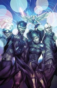 Characters of different cultures, ethnicities, and locales have always been an issue in comics. For one, most writers are either from the US or England. The latter might tend to do a better job because of the international mix (particularly to Londoners), and the lively mixture that is Europe in general. Plus, readers are an issue here as well. Projects involving such are extremely varied in reception, and rarely that successful. Black Panther (I hate that name, BTW- it’s from a time when every character of color was “Black” something AND it denotes a militant political stance. “The Panther” would be fine, and would make him more accessible to multi-media), Mister Terrific, Justice League International, Milestone Comics, Static Shock, and Batgirl herself are all in that umbrella and went under the axe. Most folk want to stay on their home turf so they can identify with the title; it’s their comfort zone, and often, their only point of reference. My first multicultural exposure was in the Super Friends cartoon-to-comic adaptation with the Global Guardians, who wound up going mainstream and giving us Fire and Ice, most notably, as well as a handful of other characters, a lot of whom wound up in the pages of the ingenious JLI title of the ’80s-’90s. I was enchanted with them from the get-go. They were exotic and cool in concept. I was thrilled when they made the jump (Little Mermaid getting her head blown off really freaked me out, though). I didn’t pursue the latter day JLI title because I felt kind of “been there, done that” about it. The Giffen-DeMatteis run pretty much put the period at the end of the sentence for me. I’d just love a well-done series about Fire and Ice, Tasmanian Devil (a gay character, no less), and a whole lot more. There are also lots of other worldly locales I’d like to see in the books. Night and Squire was a great little mini-series about the eccentricities of superhero London. It can be done. Morrison, in particular, has tried to integrate the rest of the world into the DCU proper, and none of it has been seen so far to stick. The Japanese group the Great Ten was a fun ensemble of his making, followed by the Super Young Team, who exited me greatly when the pre-series released notebook of Final Crisis was received. It was a great reflection of Japan’s pop culture, which often takes our domestic concepts, then filters and reworks them into something different, and sometimes magical. Each member is a translation (but not at all literal) of US super-folk. Most Excellent Superbat (Heino) is the team leader. He wears a wild red and yellow uniform influenced by both Superman and Batman. His power, as stated is “being rich”, and he uses an array of gadgets, one of which can generate an energy-based exoskeleton, he also appears to have some training in the martial arts. He is joined by Big Atomic Lantern Boy, Shy Crazy Lolita Canary, Shiny Happy Amazon, Well-Spoken Sonic Lightning Flash, and Sunny Sumo. This pack are a gas, who become big celebrities in their home and suffer for their notoriety. They had a mini-series, and in common with most of the titles presented here, it was not a success. I wish they’d come back, but I have a feeling that’s not going to happen.
I don’t know what the solution is to getting invested readership for these kinds of titles. I realize a majority of comic readers are white (more ethnic minorities do seem to be getting into the act I’ve noticed-that’s a good thing), I know a healthy amount of the followers of this site are all over the world, too. Maybe there’s hope for the concepts, and hopefully they will be done well and stand the test of time. I really hope the Universes can move away from just White America, and get support.
I still think the Black Bat of Hong Kong is undeniably a good and sound idea, and I hope someone figures that out and brings it to fruition. It’s been so long, and a lot of miss our favorite quiet assassin. Save Cassandra Cain!
The first image was from http://jbramx2.deviantart.com/, and the bottom photo was taken by http://s3.photobucket.com/user/dstorres/profile/. Both are Bat-Badassed.
CASSANDRA’S THE QUIET TYPE, BUT YOU DON’T HAVE TO BE. LEAVE ME COMMENTS/COMPLAINTS/FEEDBACK. I DIG IT!
